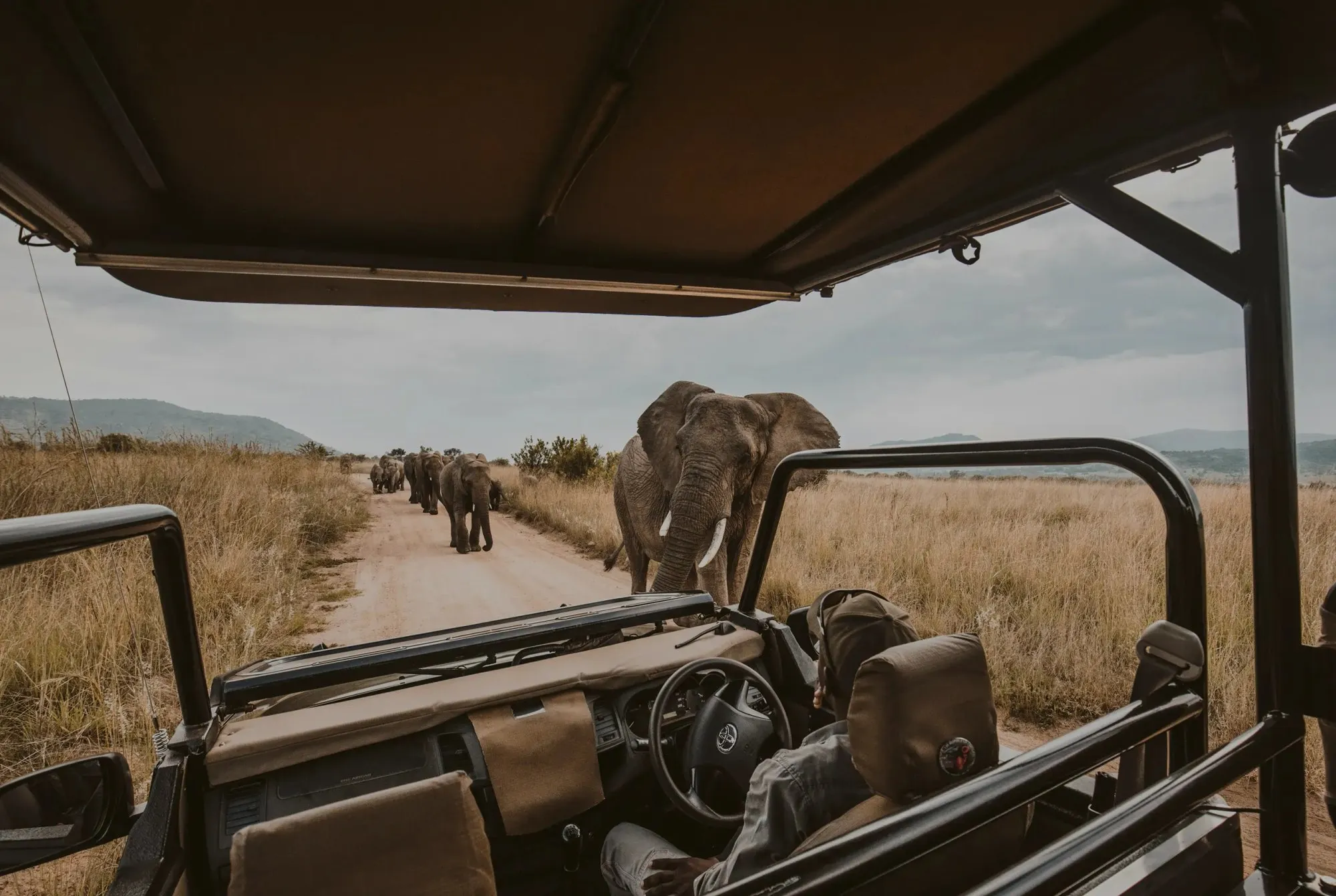
Simba Paka Safaris
Brand identity and website for a boutique safari operator
Client
Simba Paka Safaris is a boutique East African tour operator with over 14 years of experience crafting bespoke wildlife and cultural expeditions across Kenya, Tanzania, Uganda, and Rwanda.
- Role
- UI/UX Designer
- Year
- 2026
- Industry
- Travel
- Hospitality
- Ecotourism
- Scope
- Branding
- UX/UI Design
- Web Design
- Stack
- Figma
- Adobe Illustrator
- Adobe Photoshop
- Live site
- simbapakasafaris.com ↗
Challenge
Simba Paka Safaris had outgrown its original brand. The visual identity felt dated and generic — it didn’t reflect the intimacy, expertise, or premium quality of their bespoke safari experiences. Prospective travelers struggled to distinguish them from dozens of similar operators in a crowded East African tourism market.
My Role
As the sole designer, I owned the rebrand from discovery through delivery — conducting competitor audits, leading stakeholder workshops, and building a scalable identity system paired with comprehensive brand guidelines.
From initial moodboarding through final asset production, I shaped the visual language, custom iconography, and photographic direction, ensuring every touchpoint communicated warmth, authenticity, and adventure.
Brand Research & Insights
Traveler interviews, competitor benchmarking, and a review of existing marketing materials revealed three key gaps in the brand:
- The photography relied heavily on stock imagery that could belong to any safari operator. There was no distinctive visual point of view — no signature color, texture, or composition style to anchor the brand in memory.
- The messaging was feature-driven rather than emotion-driven. It listed itineraries and logistics but failed to evoke the transformative feeling of being on the ground in the Serengeti or Masai Mara.
- The visual identity lacked warmth and craft. The logo, typography, and layout felt corporate rather than experiential, missing the earthy, human quality travelers associate with authentic safari culture.
These insights directly shaped the rebrand strategy — shifting the brand from informational to aspirational, and grounding every visual decision in the textures, tones, and rhythms of the East African landscape.
Design Process & Deliverables
I developed a cohesive visual identity system that unified Simba Paka Safaris across digital, print, and on-the-ground guest experiences.
Key elements of the system included:
- A reimagined logo inspired by the silhouette of an acacia tree and a big cat in motion, paired with a hand-refined wordmark that balanced elegance with approachability.
- A layered typography system using a warm serif for headlines and a clean sans-serif for body text, establishing clear hierarchy across web, print, and signage.
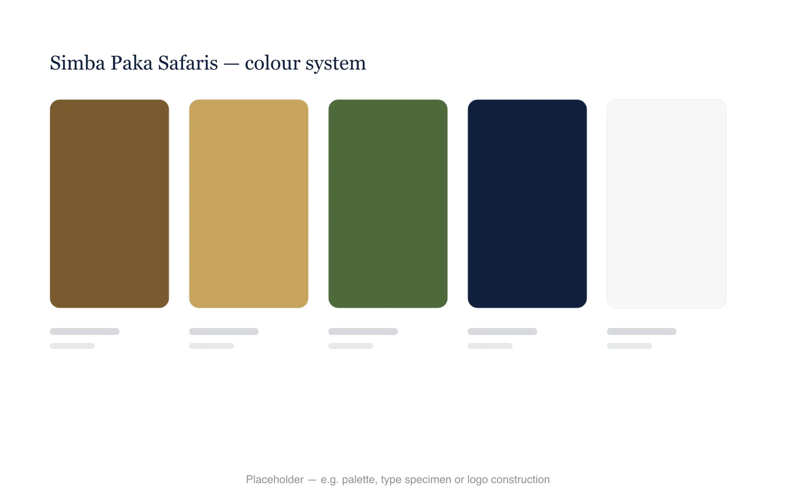
- An earthy color palette drawn from the savanna — golden amber, deep terracotta, charcoal, and soft ivory — designed to feel premium yet grounded in nature.
- A custom illustration suite depicting wildlife, landscapes, and cultural motifs, making complex itinerary details more visual and engaging.
- A flexible grid system enabling consistent layouts across the website, social media templates, printed brochures, and lodge collateral.
The website was fully redesigned around a story-first architecture, guiding visitors from inspiration through destination discovery to seamless booking — built for both first-time safari-goers and returning guests.
-
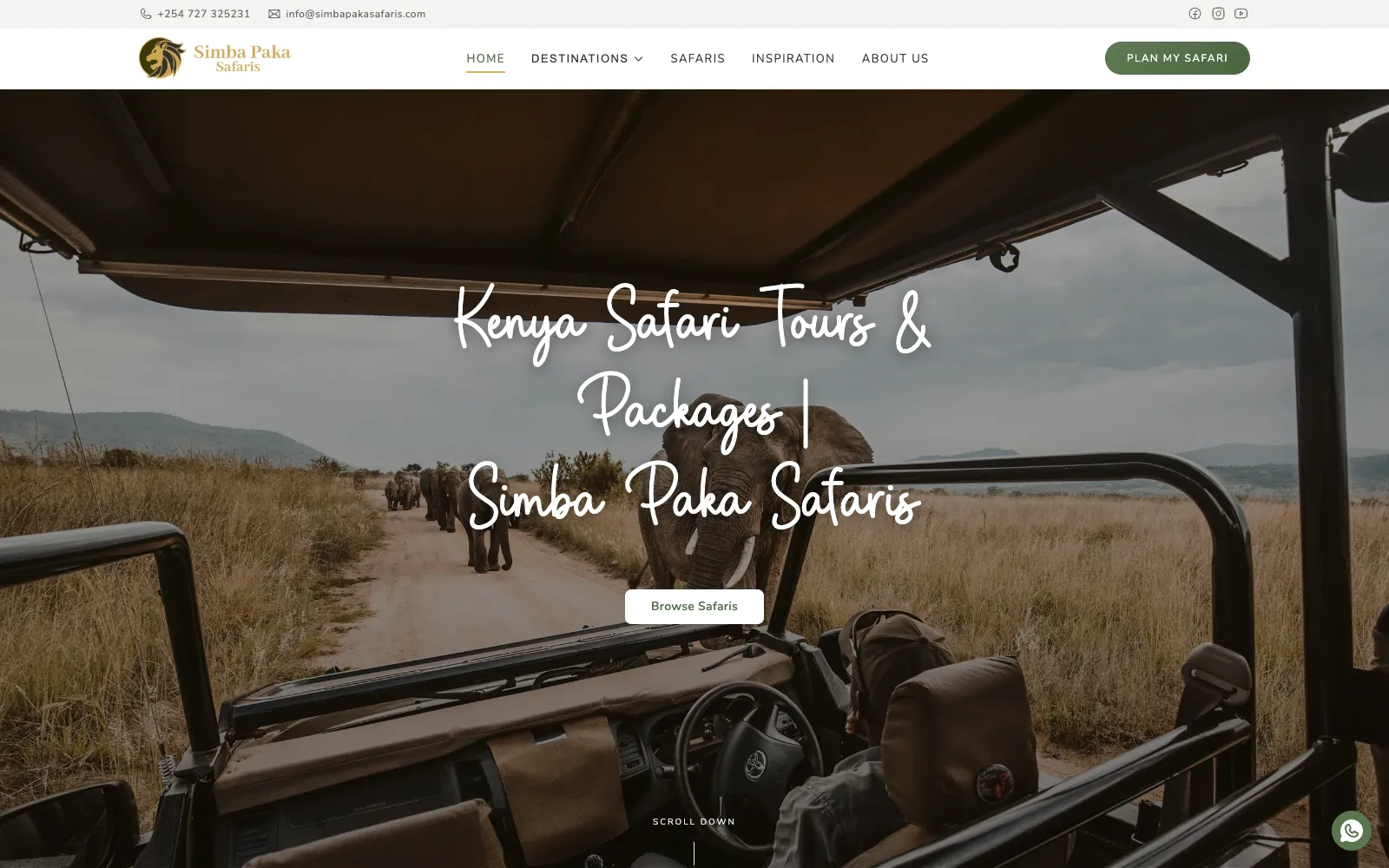
Homepage -
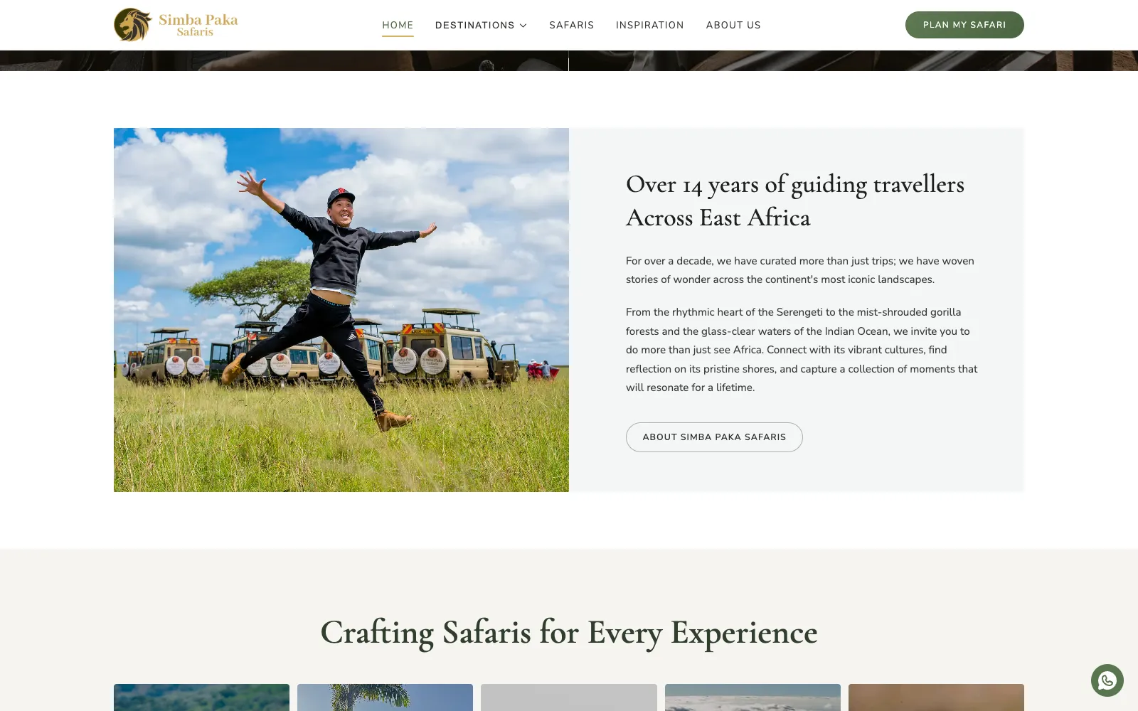
Homepage, scrolled -
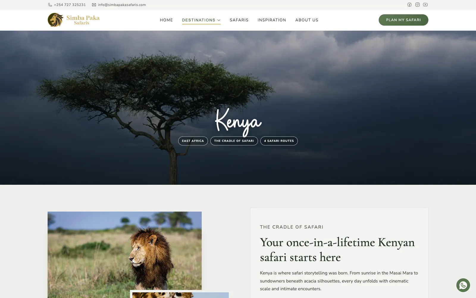
Destinations — Kenya